Introduction
Think of all the books that you have read for leisure, work or school in your lifetime. How many of your textbooks, novels, memoirs, and instructional books have images? Now imagine those books with all of the images omitted. Undoubtedly, this would make the experience of reading the books frustrating and challenging, especially if you need those books for employment and educational purposes.
This is the reality for many readers around the world who have a print disability (which includes individuals who are blind or visually impaired, people with cognitive and comprehension disabilities, and persons who have physical mobility challenges), but happily, there are ways to address this issue! Including image descriptions in your books is the best way to ensure that your publications can be fully understood, and fully enjoyed, by all readers.
In the following pages, we will provide information on:
- The Importance of Image Descriptions
- Who should Describe
- Terminology
- Technical Guidance and Code Samples
- Image Description Guidelines, with examples
- Further Resources
The Importance of Image Descriptions
We have developed the following list of points which explains the importance of including accurate image descriptions.
- Accessible images can teach and empower! Have you ever heard of Tim Cordes, Haben Girma, Jean Little, and Erik Weihenmayer? Tim Cordes is a blind physician who earned a Doctor of Medicine degree from the University of Wisconsin–Madison. Haben Girma is a lawyer and motivational speaker who is the first Deafblind graduate from Harvard Law School. Jean Little was an award-winning Canadian author who was blind. Erik Weihenmayer is an adventurer and speaker who is the first blind person to reach the summit of Mount Everest. These are all highly talented people who rely on or have relied on accessible images to get some of their information due to their print disability.
- Accessible images reach more people! In Canada, 1 in 5 people have a print disability; this is a sizable portion of the population, and does not even include an aging population (many of whom have deteriorating eyesight). Without accessible images, many of these people are prevented from fully accessing content. This is a challenge for them, and may be detrimental to publisher and authors, since the disability community has massive buying power. It is like walking away from an investor who is offering billions of dollars. That is similar to what is happening here when images are inaccessible. According to SenseAbility.ca, the Canadian disability community has 88.2 billion dollars of disposable income annually. Globally, this figure jumps to $1.9 trillion annually, all the way to over $10.7 trillion annually if we include families and friends who have a connection to someone with a disability, according to the Return on Disability 2020 report. The more accessible your books are, the more potential readers you have!
- Accessible design benefits everyone! Wheelchair ramps were seen as a burdensome requirement when they were first introduced but are now widely used, not only by people in wheelchairs, but also by parents with strollers and travelers with big suitcases. This is the same with image descriptions (on the internet). When you make images accessible on your websites, it does not only benefit readers with print disabilities. Image descriptions will improve SEO (search engine optimization), meaning that your content will be more discoverable to everyone because search engines can easily index the machine-readable text. Image descriptions also benefit people trying to view your images on a mobile device; readers can get frustrated when they have to pan around a screen to see the entire image or the graphic does not load due to low bandwidth. When image descriptions are included, the visitor can access these instead.
Who is Responsible for Writing Image Descriptions?
There is no question that writing image descriptions can be time-consuming and challenging, especially when considering more complex images. The question of who should create and write image descriptions is an important one, and there are a few options.
If you outsource your ebook production to a conversion house or independent ebook developer, they may offer image description services for an added fee, ranging from around $2.00 to $30.00 per image depending on the images and the level of detail required. Another option is to incorporate the work into your production process by having interns, copyeditors, or others who work with the book, write the image descriptions. Another option used by some conversion houses and publishers is to outsource to subject matter specialists, especially when the images display complex or technical concepts.
Requesting Image Descriptions from Authors
The person in the best position to describe the content accurately is often none other than the content creators themself. The author is the one who is closest to the content, and they know what they intend to convey with a particular image. When you have conversations with your authors, be sure to talk about images, and let them know them that for ebooks to be accessible to everyone they need to have accurate and meaningful image descriptions – which the author is best positioned to write and provide. Just as they likely would not want to give complete control to an editor on a paragraph, they will surely want to ensure that the description of their images convey their intended meaning. Having authors write the image descriptions also ensures that they can be built into your workflow from the start. While the descriptions require some editing and copyediting, it will take less time than it would for someone unfamiliar with the content to describe an image from scratch.
While some authors may be hesitant to provide image descriptions, we have seen that many are more open to the idea when they learn that it means that their books will be more accessible. The more accessible a book is, the more likely it is to be understood and enjoyed by the widest possible audience.
A Note to Describers
We have found that people who spend time crafting descriptions become better communicators. It is a wonderfully reflective process that allows you to explore whether the image is conveying what you want it to say. If you or a co-worker have trouble interpreting the meaning of the image, it may indicate that other readers who do not have a print disability could run into the same challenge. Therefore, thinking about image descriptions will lead to a better idea of what images are important to include, what images may need to be changed, and how to improve on the narrative either through the surrounding text or within the image description.
If you are new to describing images, you may feel overwhelmed and unsure where to begin. This is perfectly all right. Writing great image descriptions takes practice. As you continue to do more you will get better and better at it so be kind to yourself as you learn. We at NNELS believe that a simple image description is better than no description at all. In our own journey to provide image descriptions, we sometimes feel like this is more of an art than science!
Terminology:
Image Description:
The term image description is an umbrella term referring to the concept of offering descriptions of images in text form. An image description conveys the same or equivalent information that a sighted reader would get when they look at a picture, to someone with a print disability such as those who are blind or visually impaired. Image descriptions can be included in digital content in two forms: alt-text and Long Description.
Alt-text:
Alt-text, also known as alternative text, offers textual description of images. These text descriptions are visually hidden but when a blind or visually impaired reader encounters an image while using their screen reader, the alt-text will be read out.
Descriptions are generally concise. There are no hard rules on how long alt-text should be, but they are usually a short phrase or at the most, a couple of sentences. We have found that well-written alt-text in ebooks tend to be slightly longer compared to images on websites. You may hear that alt-text should not exceed 125 characters, as screen readers may cut it short; in our experience, this can occur on pages on the internet, but we have not come across this issue when reading EPUBs on reading applications.
Long Description:
A Long Description is a detailed text description of an image that can be several paragraphs long and/or may contain other elements such as tables and lists. This technique is generally used for complex images where spatial information needs to be conveyed to the reader such as maps, graphs, and diagrams.
If Long Descriptions are used, they will be visible to anyone because they could be inserted in the surrounding text or on a separate page along with links that allow readers to navigate to them efficiently.
Every non-decorative image requires alt-text, even if a long description is also provided.
Note: You may be familiar with the HTML attribute of Long Description – “longdesc”. This attribute is not supported by EPUB, but the purpose, and therefore the name, is the same.
Writing descriptions for complex images can be a complicated undertaking. While all the guidelines in this resource do apply to both alt-text and long descriptions, we encourage you to visit our Long Descriptions resource for more information on how to describe complex maps, graphs, charts, and more.
Caption:
A caption is a visible text component which accompanies an image and provides additional information. It may describe the image briefly and/or give contextual information about the source. It does not usually describe the image in great detail but instead, works in conjunction with the image.
When it comes to accessibility, captions are optional, but image descriptions are not.
Non-decorative Images
Non-decorative images are graphics whose purpose is to add meaning to the content. They are considered an important part of a book (or other type of content), and must be described so that screen reader users are able to access all of the information presented in the content.
Decorative Images
Decorative images are graphics whose purpose is to enhance visual appearance, and do not convey any meaningful information. They often do not need to be described. Exceptions include images like the book’s cover, or other images that may be objects of discussion among readers.
Technical Guidance & Code Samples
If you are producing your books in EPUB, here are code samples demonstrating how to implement alt-text, include long descriptions, and deal with decorative images.
Alt-text
Let’s look at alt-text first. We start with the figure element. This element is a container that semantically removes the image from the main flow of the document.
<figure id=”Fig1″>
Next, we link to the location of the image and then add the description between the quotes in the alt-attribute. This is all within the image element.
<img src=”image/fig1.jpg” alt=”A German shepherd puppy runs in a field” />
Finally, we can add a caption (this is optional), and close our tags.
<figcaption><p>Image from NNELS</p></figcaption>
</figure>
The “alt-text” is the description that is included within the “alt attribute” in an <img> element.
A Discussion of the <figure> Element
The <figure> element represents self-contained content, and may include an optional caption, which is specified using the <figcaption> element. The figure, its caption, and its contents are considered as a single unit, and are somewhat separate from the narrative flow of the main content; therefore, using <figure> tags helps screen reader users know they are interacting with an element that is separate from the main content.
If an image does not have a caption, or is a part of the narrative flow of the content, then using a <figure> element is not technically required. Nevertheless, using <figure> tags for non-decorative images is generally considered a best practice.
Long Description
If your content relies on complex images, you will need to offer long descriptions so that your readers can dive deeper into the facts and figures being conveyed. By including a link to an accessible description, we can have this information in the publication without disrupting the reading experience. Long descriptions can also be included on the same page as the image, if that works for your content.
Here is an example of the method of linking out to a long description, elsewhere in the book, based on a figure for which we drafted a description.
Example
First, include a note in the alt text which tells the reader they can expect a link to a long description. Then, place a link to the long description after the image, either between the image tag and the figure caption (in bold, below), or simply after the image if there is no caption. In this example, the long description consists of a table.
<figure id=”Fig2-1″>
<img src=”image/Fig_2.1_Denning_mc.jpg” alt=”Graph showing the increasing trend of the American population in the lower Great Lakes watershed from 1840 to 1920. See the link below the image for an extended description.” />
<p><a href=”AccessibleContent.xhtml#Fig2-1″>Long Description of Figure 2-1</a></p>
<figcaption><p>Figure 2.1. American population of lower Great Lakes watershed, 1840-1920.</p></figcaption>
</figure>
Notice that the coding for the image is the same as in the alt-text example above, except with the addition of the link.
Then, create a file where you will put your long descriptions (our example is titled AccessibleContent.xhtml), and add the document to the book’s <manifest> and <spine>. Set up the document with a similar structure to the other documents in your book, starting with a level-one heading for Accessible Content/Long Descriptions.
Then, add an appropriate level two heading with an id that matches the link under the original image. Under that heading, place the image again, and code it as decorative (this will help low-vision readers). Finally, write out your long description or code your table, and link back to the figure in the main narrative.
<h2 id=”Fig2-1″>Figure 2-1</h2>
<img src=”image/Fig_2.1_Denning_mc.jpg” alt=”” role=”presentation” />
<Table Summary=”American population in the lower Great Lakes watershed”>
<tHead>
<tr><th>Year</th> <th>Thousands of People</th></tr>
</tHead><tBody>
<tr><td>1850</td> <td>750</td></tr>
<tr><td>1860</td> <td>900</td></tr>
</tBody></Table>
<p><a href=”IJC-8.xhtml#Fig2-1″>Return to Figure 2-1</a></p>
For more guidance on providing Long Descriptions in EPUBs, see the W3C’s “Providing a Long Description in another location with a link to it that is immediately adjacent to the non-text content” (this is only available in English). And, for more information on writing long descriptions, visit our Long Descriptions resource (coming soon).
ARIA Roles
ARIA roles provide more information about the structure of a document for users of assistive technologies.
For an extended look at ARIA, check out NNELS’ guide to EPUB Semantics, ARIA Roles, & Metadata, and the EPUB Structural Semantics to ARIA Roles Mapping Guide.
With respect to image descriptions, the ARIA role you need to know about is “presentation”, which is added to decorative images, so that screen reading software knows it is okay to skip this content.
Decorative Images
Here are three questions to ask yourself when deciding whether to write a description or not:
1. Is the image purely aesthetic?
If the image is purely aesthetic, such as some borders and backgrounds, there is no need to describe it. The best way to do this is to leave the title and alt-attributes blank (i.e., including no text or space between the quotation marks in the alt-text field (alt=“”), and add an ARIA role of presentation. This ensures that the screen reader skips over the image, and causes no confusion for the reader.
Example
<img src=”image1.png” role=”presentation” alt=””>
2. Is the image decorative but still serving a purpose? This could be the use of custom images for context breaks.
If the image has a purpose but uses a decorative image as a placeholder such as a context break, it is important to let the reader with a print disability know as well. They are useful to the reader in that they indicate scene changes or transitions to other topics but at the same time, the design is not relevant to the understanding of the content, so the best approach is to use the HTML <hr/> element in an EPUB. The reader will easily understand that a transition has taken place but not get bogged down by a description of the design you chose for your image.
Here is a code example which demonstrates how to use an image for a context break, while using the <hr/> element.
Example:
In the CSS:
hr.image {display:block;background: transparent url("images/sectionBreakImage.png") no-repeat center;height:2em;border:0;}
In the HTML:
<p>This is the sentence at the end of a section.</p>
<hr class="image" />
<p>This is the sentence at the beginning of the next section.</p>
Note that you will need to change the URL to direct systems to your image, and you may need to play around with the sizing/spacing.
As screen readers come across this element, they will announce “separator.”
For more options on coding <hr/>, like using a character or extra white space, check out the Context Breaks section in our Common EPUB Issues resource!
3. Will the image come up in conversations such as in a book club or discussion with friends?
If the image can be a conversation piece, it needs to be described. There are many instances where readers in book discussion groups, online and in person, have commented on how interesting a particular visual element of a book is, such as the book’s cover. People with print disabilities want to be part of the conversation, and feel excluded when publishers do not describe all of the book’s images.
For more technical information and techniques on implementation, you may wish to read the Accessible Publishing Knowledge Base on Images.
Image Description Guidelines
The following image description guidelines were written by some of NNELS’ accessibility testers, and are organized by important concepts and considerations of image description.
- Decorative images do not need to be described
- Write descriptions with a clear structure
- Write descriptions based on context
- Write for your audience
- Aim for conciseness
- Use present tense / action verbs
- Write out abbreviations and use MathML
- Be objective
- Do not censor
- Text within images need to be written out
- Don’t rely on captions
1. Decorative images do not need to be described.
Decorative images whose only purpose is to enhance visual appearance do not need a description since they do not convey any useful information to the reader.
Here are three questions to ask yourself when deciding whether to write a description or not:
- Is the image purely aesthetic? This could be borders, backgrounds, or small decorative images. For example, drawings of banana peels and eggshells beside a list of compostable foods would not require alt-text.
- Is the image decorative but still serving a purpose? This could be the use of custom images for context breaks. These images do not require descriptions, but do need special treatment. See: Technical Guidance & Code Samples: Decorative Images.
- Will the image come up in conversations such as in a book club or discussion with friends? This could be cover images, or even author photos. If it prompts discussion, it needs alt-text.
For help writing code, see: Technical Guidance & Code Samples: Decorative Images.
2. Write descriptions with a clear structure.
Work from the general to the specific: provide an overview of the image before you describe specific details. A strategy we use is to break the image up into its component parts, and then organize them so that the description makes logical sense.
For charts and graphs, we recommend providing an overview such as the type of visualization, the labels on the axes, and the number of lines, before getting into the details where you would describe the shape of particular lines or trends.
Structuring Long Descriptions
Example 1
This example comes from our COVID-19 project. We start with a general overview of the graph (“A graph with horizontal bars depicting the Age and gender distribution of COVID-19 cases”), and then break down some specifics.
Note that the long-description repeats the alt-text: In the context of an ebook, it is fine to repeat all or part of the alt-text, because it can help jog the reader’s memory if they decide to return directly to the Long Description later on. If the Long Description dove into describing the axes, the reader may miss the context.
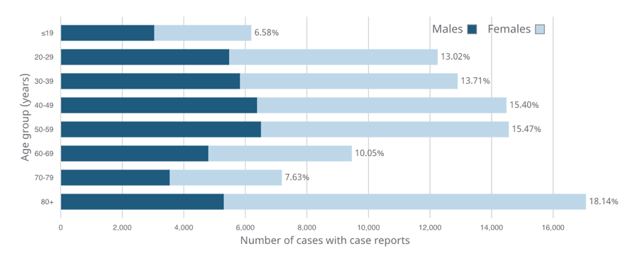
[Alt-text]: A bar graph with horizontal bars depicting age and gender distribution of COVID-19 cases in Canada. See the link below the image for an extended description.
[Long Description]: A graph with horizontal bars depicting the Age and gender distribution of COVID-19 cases. The Y-axis is labelled as “Age group (years)”, and the X-axis is labelled as “Number of cases with case reports”, which range from 0 to 16,000 in increments of 2000. At the end of each bar, is the “Number of cases with case reports”, also shown as a percentage.
The group with the shortest bar is those who are 19 or younger. The bars increase steadily through ages 20-29; 30-39; 40-49; and peaks at ages 50-59. The bars decrease through ages 60-69 and 70-79, before sharply rising in the 80+ age group, which has the longest bar.
Each bar also shows the breakdown between the number of cases for males and females, represented by dark blue and light blue colours, respectively. In all cases, the length of the dark blue (males) portion of the bar, is less than half the length of the light blue section, indicating that there are more cases for females, compared to males, in all age groups.
Complete data can be read in the following table: (here you would insert the data table if you have access to the data).
Example 2
If the image is a photograph of a person, you want to start by describing things that immediately jump out at you such as special photography effects or anything that is prominently portrayed in the image. Next describe the setting, expressions, and if applicable, any actions taking place. Finally, describe what they are wearing.

[Long Description]: Photo of a young light-skinned man in which his face and wrist are the only areas showing colour, so that the image takes on the effect of a black and white photo.
The man stands on a staircase with his hands in his pockets and is facing a railing. He gazes slightly off to the side, staring into the distance with his mouth closed and lips touching. He has a close-cropped beard with a thin moustache and solid dark eyebrows.
He wears a black New York Yankees cap, waist length black leather motorcycle jacket, and black pants. The area is illuminated with natural light indicating that the picture has been taken during the day.
Structuring Alt-text
In the Long Description, we began with a description of how the image appears as though it is a black and white photo first. This is because it is something that is noticeable right away. However, this is not a vital detail in the alt-text, so instead we just discuss the setting and action.
Example

[Alt-text]: A Young light-skinned man sporting a waist length black motorcycle jacket , stands on a staircase, outside, facing a railing. Hishands are in his pockets, as he looks slightly off to the side.oking slightly off to the side.
3. Write descriptions based on context.
Context is important. The audience, surrounding text, related images, and many other factors will influence the description you are making.
Example 1
Consider the following excerpt from Graphic Design and Print Production Fundamentals:
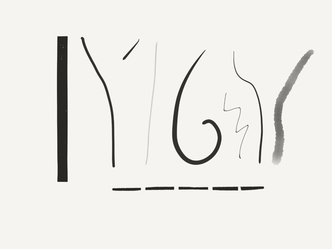
[Alt-text]: Curved, straight, thin, thick, solid, and broken lines, some of which have straight crisp edges while others are imperfectly straight with fuzzy edges.
In the surrounding text, the author gives a detailed discussion of lines, including possible styles, approaches, and their impact.
From the surrounding text and caption, it is clear that the image is a drawing of lines, so we have not included the word “drawing” or “illustration” at the beginning of our alt-text. The text discusses the quality and interpretation of different lines in general, but does not discuss specific lines from the image. Thus, we do not have to describe all 8 lines individually, and a Long Description is unnecessary. Instead we just need to provide a little more information that can help the reader fully understand the passage, such as the visual effects of hand-drawn versus digitally drawn lines. The passage refers to the effect briefly but without the alt-text, the reader might not be able to easily glean this from reading the text.
Example 2
What if we are dealing with two images where one is a continuation of the other? Here is an example from the textbook “Wellbeing in Educational Contexts” from the University of Southern Queensland to which we have added alt-text. In Chapter 6, the authors use photographs to illustrate ways to promote wellbeing in the school environment.
[Surrounding text]: Educational contexts should be committed to providing safe, inviting and welcoming learning spaces so that students experience a feeling of belonging. These spaces should also be places of quality learning and teaching where the learning needs of each individual are acknowledged and catered for so that success as determined differently by each individual, can be experienced and celebrated (as shown in Figure 6.4).
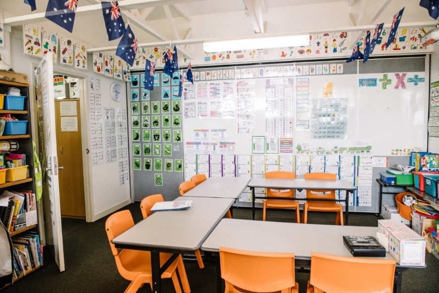
[Alt-text]: Classroom with orange chairs around tables. Mini Australian flags hang down from the ceiling. Blue and green posters cover 1/5th of the far wall; a variety of other learning materials cover the rest, all accented by myriad coloured letters and highlights.
[Surrounding text]: Pictured in Figure 6.5 is an example of an inclusive learning classroom which is rich in visual scaffolding that supports the delivery of explicit instruction.
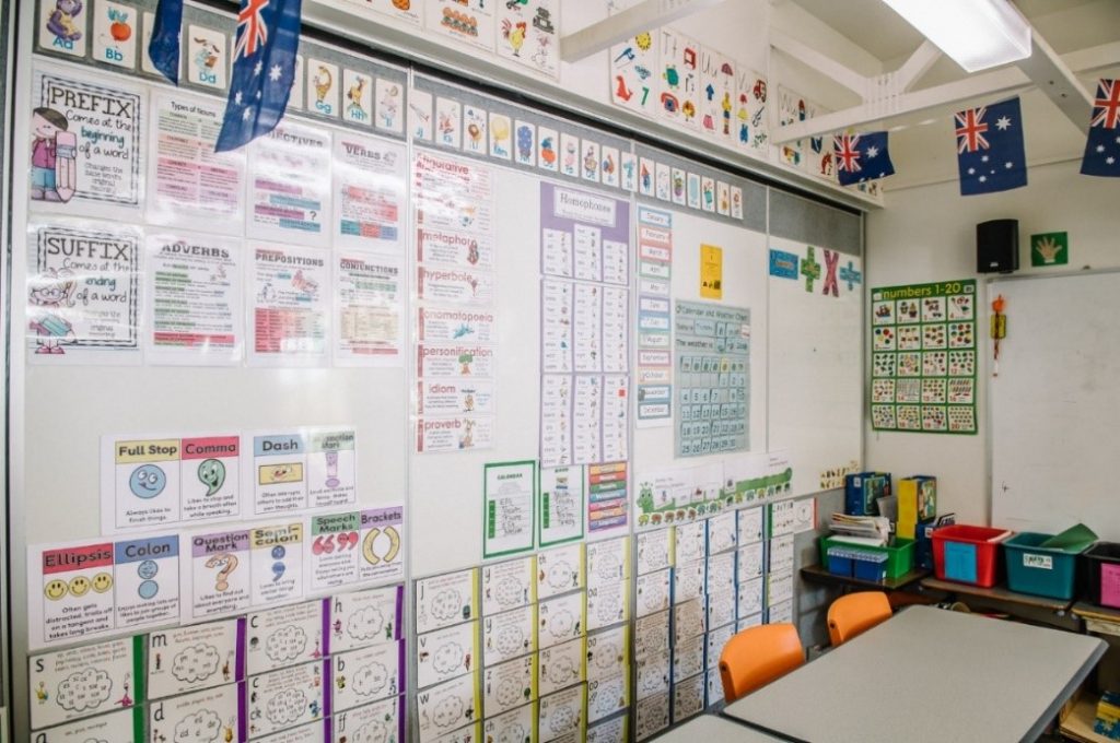
[Alt-text]: A closer view of figure 6.4 showing the remaining 80% of the back wall, covered with cards, posters, mathematical symbols, a board of letters, and charts, all with accented areas of color. The flags and a couple of the chairs seen in the previous photo, are still partially visible in this image.
As you can see, there is a lot going on in those pictures. In order to provide an effective description, we have to figure out the main idea from the surrounding text and try to interpret meaning through what the images show. In this case, it appears as though the authors want to show a welcoming environment by first showing an overview of the area decorated with a variety of colorful objects to make the space feel welcoming, followed by a closer view of a board of learning materials.
For figure 6.4, we have intentionally done our best to describe the objects that are in the picture rather than say something like “colourfully decorated area giving a sense that the space is welcoming using bright colours”. This is because we want to provide a similar experience where readers can make those connections and determine the meaning for themselves just as sighted people do. We have also structured the piece of alt-text to provide an overview first, before discussing specific objects.
For figure 6.5, the focus is on the board of learning materials. Therefore, we have discussed this in some detail first, before providing extra information about what is visible in the photo. Some describers might argue that the sentence, “The flags and a couple of the chairs seen in the previous photo, are still partially visible in this image.”, is irrelevant but in fact it adds continuity from the previous picture and enlivens the description since it conveys the style and even the camera work.
Example 3
Another factor to consider is language, style and tone. Try to write descriptions that match these elements based on the surrounding text. You can do this as long as it is introduced in your content prior to the reader coming across the picture or in the surrounding text where there is a clear connection to the image.
The following example from Tools for Podcasting illustrates a situation where a technical term can be used:

[Alt-text]: Pop filter (a mesh disc with a thin bezel) suspended in front of a microphone with a computer screen in the background
When we wrote the description, we needed to decide whether or not to describe the physical appearance of the pop filter. In this case, the reader may not be aware of what a pop filter looks like, specifically the shape, so we have added description to fill in that gap. If the “pop filter” has been described and used in previous sections in the book, any future photos containing a pop filter would not require additional description.
4. Write for your audience
Always consider the audience when writing image descriptions. Understanding the age of the intended reader or the type of person who will be interested in the content will help you craft a description that can be easily understood. For example, do not use complex terms that adults would understand but children might find challenging if your book is intended for young readers.
Example 1
Here is a page from Denslow’s Humpty Dumpty to demonstrate this:
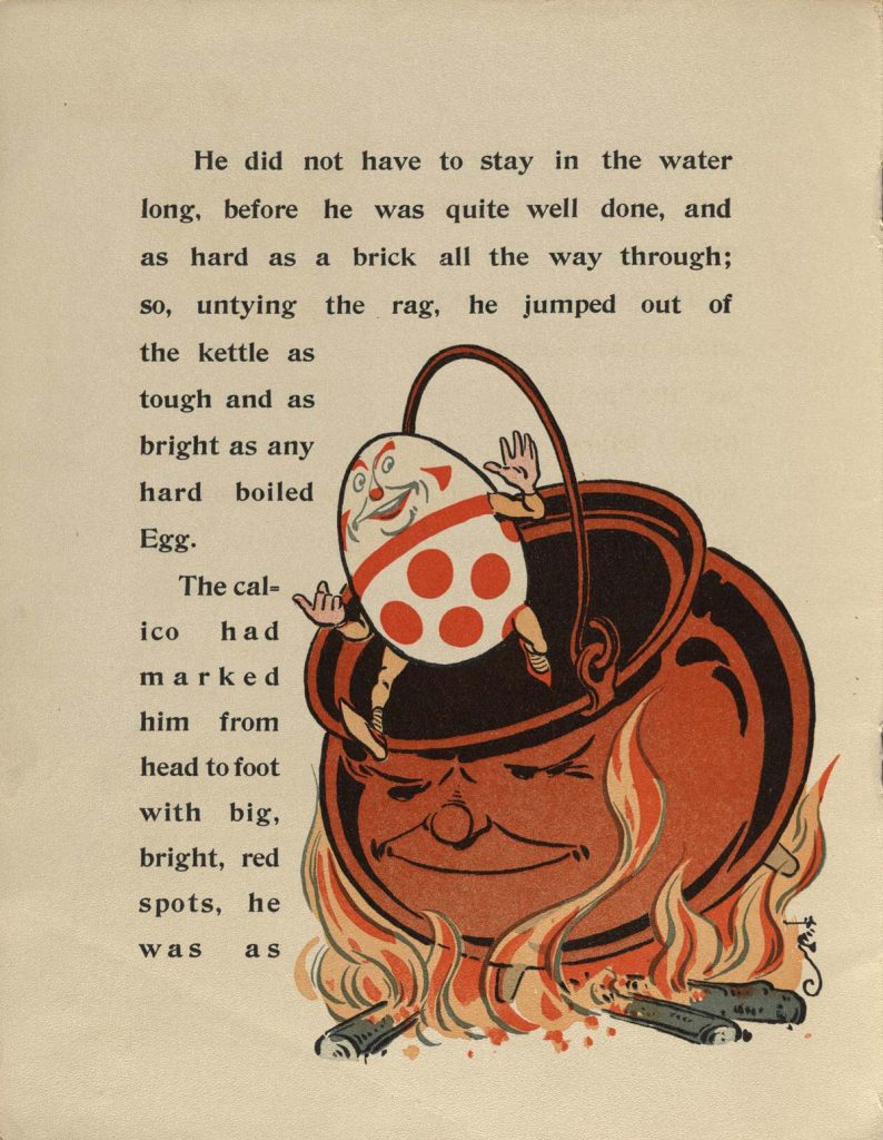
[Text on page]: He did not have to stay in the water long, before he was quite well done, and as hard as a brick all the way through; so, untying the rag, he jumped out of the kettle as tough and as bright as any hardboiled Egg. The calico had marked him from head to foot with big, bright, red spots, he was as…
[Alt-text]: This is a drawing of a smiling Humpty Dumpty in the air as he jumps out of the pot. Holding his short slightly bent arms up in the air and his legs extended, he barely makes it out as his front foot is only slightly past the lip of the pot. The brown pot has a smiling face and sits on a wood fire. Yellow and orange flames, some tall and some short, move around the pot like they are dancing.
Since the book is for young children, we have used the term “drawing” rather than “illustration” for clarity, and added “This is a” to the beginning of the phrase to clear up any confusion when reading the description. Normally we do not do this because we want to be concise, but it would not support children’s learning of strong sentence structure. We have also avoided using the phrase “in motion” to describe Humpty Dumpty’s jump even though it would be a more elegant description. This is because it might not make sense to a younger reader.
Blind or visually impaired children may have less opportunity to learn about body movements unless they are involved in sport activities. Therefore, we want to provide more educational moments where they can have access to the same information that reinforces concepts of motion. This is why we have spent some time describing the position of his legs and arms in addition to him jumping out of the pot. We have taken the same approach when talking about colours. Blind children are expected to learn about colours like their sighted counterparts and will be interested in these things in general. This is why we have described the colours of a flame
Another challenge we have had to deal with is whether to call the pot a kettle or a pot. In the text, the author calls it a kettle but because the kettle these days refers to a handle and a spout, we felt that calling it a kettle would be confusing. in order to be clear, we would have to break from our recommendation on matching language.
5. Aim for conciseness
Depending on how busy the picture is, you should try to describe it with a short phrase. It does not always need to be in full sentences. As long as it clearly describes the image, it will serve its purpose.
If the image is highly complex and technical, you can write a Long Description that will go on a separate page or in the surrounding text. Remember to still provide alt-text for an image if you offer a Long Description
Do not include phrases such as “Image of” or “picture of” as part of your description. Screen readers will announce if an image is detected, but do not have the ability to describe what is contained in the image; hence the need for alt-text. An exception to this is when you are providing more descriptive vocabulary, so if the picture is of a map or illustration, it is helpful to write “Illustration of” or “Map of” at the beginning of your description. Additionally, it may occasionally be contextually important to include these phrases, as in the example for children above.
6. Use present tense & action verbs
In order to be engaging, use action verbs to describe what is happening in the image. You can see this effectively used when we describe this graph.
Example 1
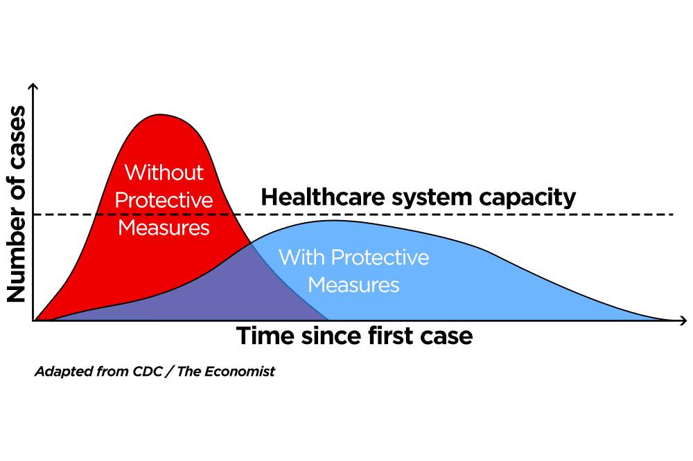
[Alt-text]: A graph illustrating the Flattened curve. Link to long description below.
[Long Description]: A line graph with three lines, illustrating a “flattened curve”. The Y-axis is labelled as “Number of cases” and the “X-axis is labeled as “Time since first case”. There are no numbers on either axis.
One line is a dotted line which runs horizontally through the middle, and represents the Health Care System Capacity. The other two lines are curved: one representing the cases without protective measures, which has a steep curve that peaks well above the “Health Care System Capacity”; and the other, representing cases with protective measures, which remains below the health care system capacity line, i.e., the flattened curve.
The curve representing “Cases without protective measures” starts at the bottom left corner and steeply rises past the “Capacity of the healthcare” line to a sharp curve at the top of the graph where it then steeply drops back down to the bottom. This line is symmetrical and is in the shape of a triangle with a rounded peak. Note that as this curve descends to the right side, it intersects with the “Capacity of the healthcare” line and the line representing “Cases with protective measures” just before the curve begins to flatten. The line representing “cases with protective measures” also starts at the bottom left corner, gradually increases at first, before rising slightly more steeply, where it stays just below the “capacity of the healthcare line”, and flattens out, before it gradually goes back down to the bottom. This curve is shaped like a small hill or an arch that rises and falls gradually and equally on both sides.
7. Mathematical Equations
It is common to use images of math formulas or equations in books and text books, and if these are not accurately described by a subject matter expert, they could cause challenges for screen reader users. Therefore, using MathML is recommended. MathML is designed to provide accessible math content that can be read on braille displays and with speech using consistent and concise language. Not all reading systems support MathML at this time, but some–including common Chrome-based browsers–do, so using MathML is nevertheless recommended. If using MathML is not an option, then be sure to provide accurate alt-text (and long descriptions, if needed) for math formulas and equations.
8. Be objective
Describe what you can see such as physical appearances and actions rather than intentions based on interpretations or judgment calls. As humans, we tend to shy away from discussing ethnicity, race, gender, disability, and age for fear that we would misjudge and use the wrong language but remember that whether you want to or not, you can immediately see these characteristics when you look at a photo. This is information that people with print disabilities should get as well so that readers can make their own interpretations.
In order to be objective, we suggest using the following terminology to describe skin tone:
- Light Skin Tone
- Medium-Light Skin Tone
- Medium Skin Tone
- Medium-Dark Skin Tone
- Dark Skin Tone
This is the same system that is used to label emojis with different skin tones. You can also use terms such as black, white, Asian, middle eastern, etc. but only if it can be determined in the surrounding text.
You can identify the subject as male or female, man or woman, only if it can be clearly identified and determined using context. Try to describe the physical characteristics and avoid using the terms “masculine” or “feminine” since it is more interpretive than descriptive. There is a delicate balance to strike between inclusive language and robust description; do your best, and ask for opinions from others if you need to.
Avoid describing age by prescribing a number or the decade because someone could appear young but is in their fifties. Instead, Use terms such as baby, toddler, teen, adult, middle aged, young, old, etc.
Expressions can be tricky. Words and phrases such as “grinning”, “intense look”, or “serious expression”, might be somewhat interpretive, depending on the context. If possible, describe how the physical characteristics appear. For example, instead of saying “neutral look” we can say “mouth closed and lips touching”; instead of saying “surprised look”, say “raised eyebrows and a wide open mouth”.

[Alt-text]: A group of people in business attire (suits, ties, blouses, etc.) stand in a circle with their arms around each other; they are smiling and looking down at the camera which looks up at them from the centre of their circle.
[Long Description]: Three women and two men stand in a circle. All have big smiles with their teeth showing and their arms around each others’ shoulders. The upper portion of their bodies and their faces are visible as they lean forward and look down at the camera, which is in the middle of their circle; it appears as though they are looking at us.
Counter-clockwise from the left: a dark-skinned young woman with black, natural, chin-length hair. She wears a white blazer over a dark green t-shirt. Next to her is a light skinned middle aged man with short blonde hair. He wears a blue sports jacket and a gray collared shirt with a necktie, decorated with narrow diagonal lines. Beside him is a medium-light skinned, middle-aged man with salt and pepper hair and beard. He has a closely trimmed beard and mustache. The man wears a dark gray blazer over a white checkered shirt and a maroon tie. Next to him is a dark-skinned, middle-aged woman with a round face and natural, mid-length hair. She wears a patterned white wool high neck sweater. The fifth person is a light skinned, middle aged woman with chin-length blond hair. She wears a cream color jacket over a powder blue blouse.
9. Do not censor
A concern that people with print disabilities have is the censorship or watering down of content from the describer due to the image containing disturbing or controversial material. People with print disabilities require equal access to the same content, and must be allowed to make the same choices for consumption of images.
Example
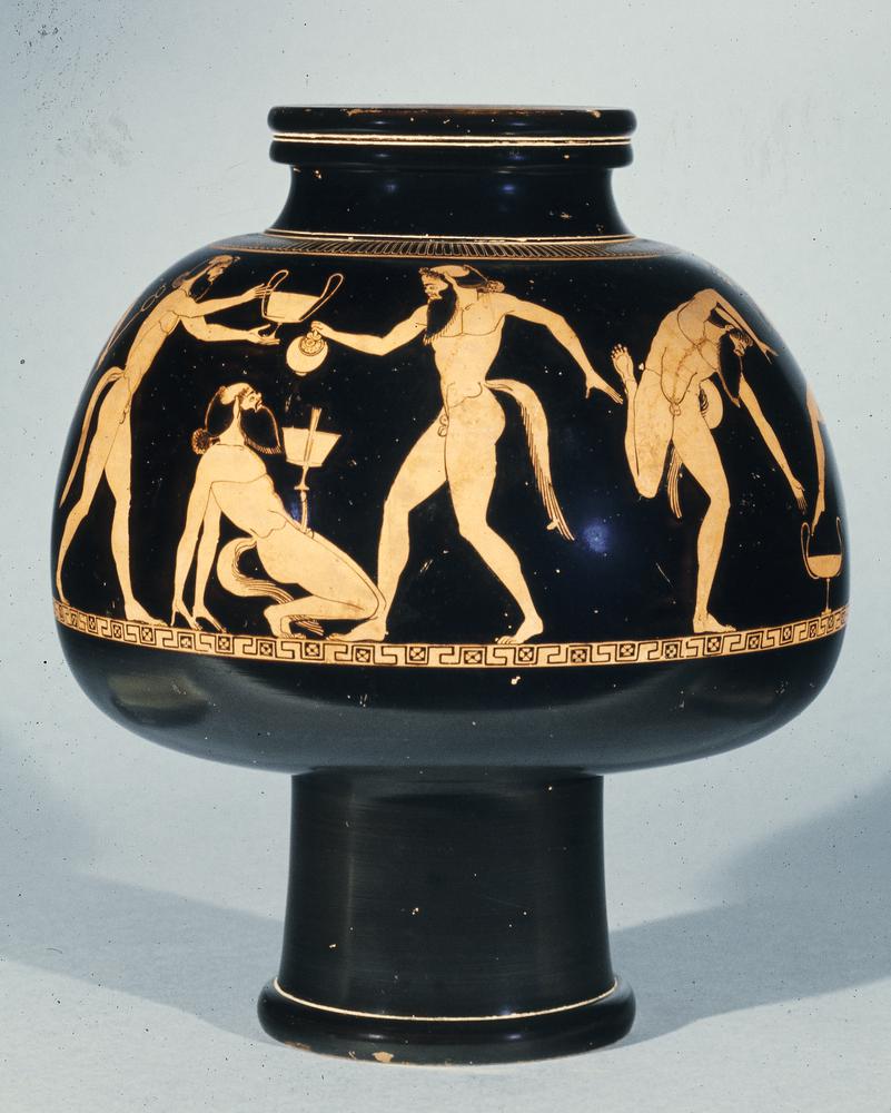
[Alt-text]: Four nude satyrs engage in drinking and revelry. One leans back on his hands, balancing a cantharos on his erect phallus. One pours wine into the cantharos; another stands behind him, holding a cantharos overhead. To the right, the fourth satyr dances around another cantharos, set on the ground.
10. Text in an image needs to be written out.
There are many images where the text is embedded within the picture. In order to make these accessible, the text needs to be written out as part of your description. OCR (optical character recognition) software can extract text from images, and even place it in the alt-text field (something that Facebook does!) but this is unreliable. If you do use this technology, we recommend using OCR as only a part of your workflow to make the image accessible, because OCR translations can have errors.
To indicate that there is text, we suggest using words such as “Text says” or simply “text” followed by a colon and then the text in quotes.
The following examples come from the Memes and Jokes for Blind Folks Facebook group. All credit goes to the describers. (Note: This Facebook group is also a great place to visit when learning about image descriptions, as each and every post is described with a variety of approaches and techniques).
Example 1
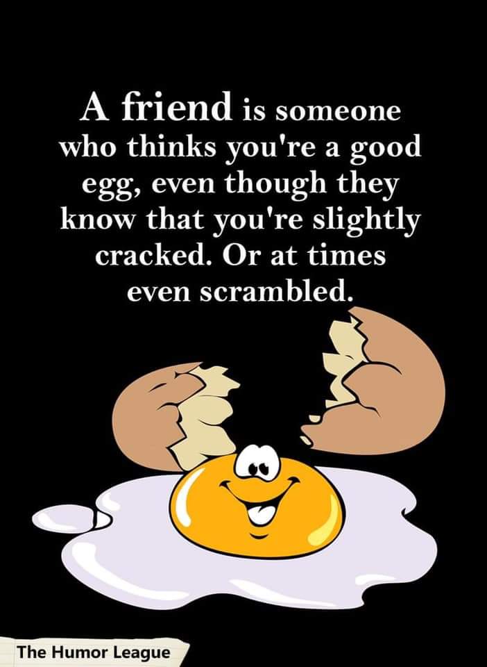
[Alt-text]: Drawing of an egg with a smiling face. Text: A friend is someone who thinks you’re a good egg, even though they know that you’re slightly cracked. Or at times even scrambled.
The text and illustration are clearly, and separately, described, making each component clear to the reader. This description is also good, in general, because it is concise and the reader can immediately pick up on the humour without having to trudge through a lengthy description.
If the text in the image is long, it will need to be included as a long description.
Example 2
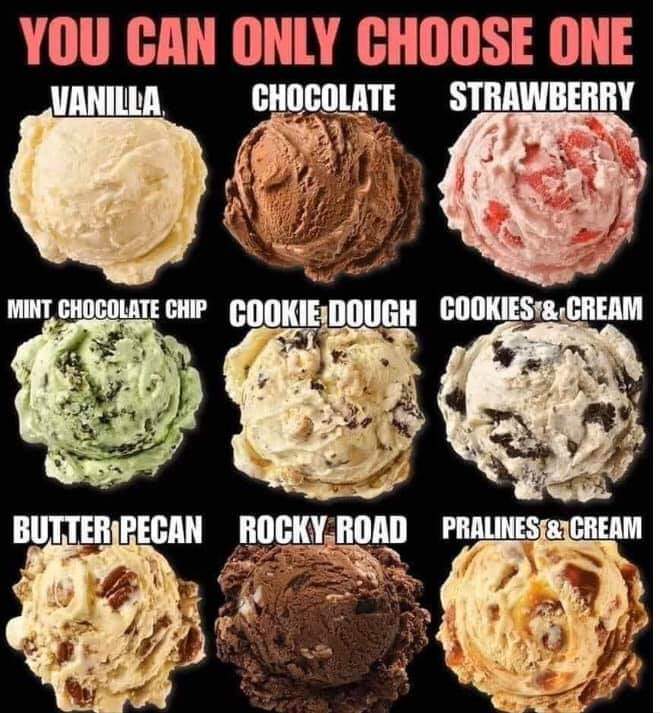
[Alt-text]: 9 scoops of ice cream pictured in a 3×3 grid. Title: You can only choose 1. From top row, left to right: vanilla, chocolate, strawberry; mint chocolate chip, cookie dough, cookies & cream; butter pecan, rocky road, pralines & cream.
Since this is nice and short, there is no need for a long description; it can be shown as alt-text. If we were to make this a long description, we would need to write out the text and create a semantic table for the grid in the image. We highly recommend you do this for large amounts of information displayed in spatial formats (see: Long Description with table data example). Since this table is tiny, it is acceptable to transcribe it this way.
11. Don’t rely on captions
A common mistake we see is the inclusion of insufficient captions, and no alt-text. For example, a caption might state the names of people in a photo and just leave it at that, and not describe any key characteristics or the setting. The problem with this approach is that the reader relying on alt-text will miss key elements.
Example 1:

In the first example, the caption offers no description of the image, so alt-text fully describing the picture is needed.
[Alt-text]: Young light-skinned man in a black motorcycle jacket, stands on a staircase facing a railing with his hands in his pockets; he looks slightly off to the side.
Example 2:
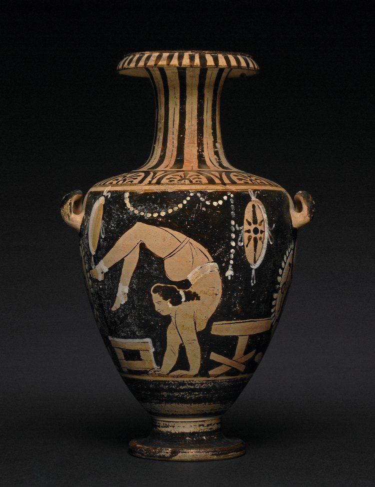
In this example, the caption offers some description, but it does not fully convey what is going on in the image, and more detail is needed. If we imagine that the image is from a non-fiction work, the following alt-text would be sufficient, as descriptions of vase types and painting styles would be discussed in the text.
[Alt-text]: Red figure painting of a young woman on a kalpis. She is in a handstand; her legs and feet are in the air, bent over her head and hanging in front of her face.
Dos and Don’ts
Dos:
- Do start with general details, followed by specifics.
- Do be clear and concise. It is important not to be too wordy or over describe a panel, since this can be confusing to a reader.
- Do be objective. You do not want to put your opinions of what is happening into the description, just what is literally in the panel. The reader should have the freedom for their own interpretation given all the necessary details.
- Do state the type of image if it is unusual or out of context, like a children’s drawing among a set of family photos in a memoir. (In this case, you would say “A drawing of…”. )
- Do pay attention to the context of the image. Is it well-described within the text? Then the alt-text can be simple.
- Do review and edit your alt-text. Ask for help, or use Thorium Reader to hear a screen reader read your text.
Don’ts
- Don’t start each description by saying “An image of…”. The screen reader will have already indicated that this is an image.
- Don’t censor: If you are uncomfortable describing a scene, whether it is violent, sexual, or something else that you feel you cannot objectively describe, you must ask someone else to describe the content.
- Don’t include any paragraph breaks or styling in your alt-text. Alt-text can only be a string of text and punctuation.
- Don’t leave the filename in the alt-text (of course it is unlikely you would do this, given that you are learning about image description, but it is so important we had to mention it!).
- Don’t rely on automatically generated descriptions. While AI is always improving, we have not yet seen great AI/automatically generated image descriptions. They can’t take into account the audience, the context, tone, voice, or intent, and all of these aspects are absolutely key to writing good image descriptions.
Further Reading:
- To see even more examples and other considerations for specific image types, visit the WebAim page on alt-text. The WebAim page is geared towards content on websites but it has some great suggestions for writing concise alt-text.
- The Image Guidelines from the Diagram Center are excellent for providing suggestions on working with different types of images, especially technical content.
- The Poet Image Description Tool, also from the Diagram Center “is an open-source, web-based tool for creating and providing guidelines to writing image descriptions for images in existing DAISY and EPUB books.” It is also a training site with many examples, guidelines, and tutorials to help people write the best image descriptions.
- The Cooper Hewitt Guidelines for image description are a wonderful resource for tackling complex visuals.